Although the life of the NS Cloner, well at least it's marketed life, has been short the team here at Never Settle decided it would be beneficial to create a more permanent and quality brand for the NS Cloner. The originally brand was thrown together in a matter of hours so that we were able to bring an MVP to market and release what we hope is a very helpful and relevant WordPress plugin to the WP Multisite community. Although the exercise is not complete we have landed on what we think is a great new logo as the foundation and launching pad for the rest of brand which will develop fully over the next year in tandem with the release of a completely new and less disjointed version of neversettle.it.The approach to the original NS Cloner branding was simple and almost stereotypical in that whenever I think of clones or cloning I cannot get Star Wars, storm troopers and the Cloner Wars out of my head. That being said the backdrop quickly became the space imagery that you see behind most of the NS Cloner brand. I took the Never Settle logo and integrated it right into NS Cloner logo, added some distressed edges and a sci-fi font to complete the look. Shadows, outer glows and other overused (ha!) Photoshop filters were made and the original brand was born. Have a look at our very first version that took the NS Cloner to market.


To ensure that there was some connection to WordPress and specifically the idea that you could clone or copy sites we added some icon style imagery to bring the idea and placed it throughout the various areas in which the brand showed up to try and bring clarity to that idea. The following was used for the banner on the original cloner pages on neversettle.it.

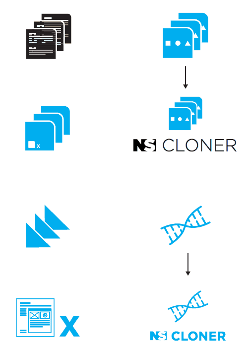
As we looked at the brand, feel and logo that we had in front of use we formulated a few requirements that we wanted to see executed and achieved. One of them was to create a slightly cleaner brand and one that told more of the product story at first glance.We started working with our very own Never Settle intern Joe Starmer whose branding skills proved to be an important piece of the puzzle. The brainstorming process was kept pretty straightforward and we were able to flush out some initial concepts over a Google Hangout and Joe was off and running ready to provide concept sketches based on those sessions. Round one produced the following...

None of the above really caught our eyes and much of what produced I felt like was a result of my pour vision and direction. The concept I found most appealing was the DNA concept and so I had Joe expand on that as well as explore some other thoughts and directions in tandem with a few of his personal ideas. During another Google Hangout not only did we discuss other concept ideas but the way the initial concepts would be delivered so that we could increase Joe's efficiency in terms or time spent during concept preparation stage. Joe suggested a pen and paper sketch approach where he would provided hand sketches of concepts that we could then explore further as interest was peaked. The following is what was created and created quickly using those tactics.

This round certainly provided some concepts that got the juices flowing and I provided some visual feedback of which some were total junk but entertaining nonetheless. At some point in that process, Joe received the following and with a lot of grace and patience, I might add.After another Google Hangout and a dose of my crazy the concept that resonated with me the most was still the DNA idea and the idea of a portal with something going in it and multiples coming out the other side. Another round of sketches landed in my inbox and I have to say that I was getting excited as they were much closer to what would become the final concept...

After sharing with the team we all really resonated with concepts 1 and 5 from the latest sketch group. The portal concept seemed to be it. I immediately replied to Joe asking for digital variations and options for these concepts of which he attacked and produced in no time.

Boom! Some awesome hit my inbox. There were come clear concept winners from this batch that we wanted to pursue. Although I liked the DNA concept quite a bit we ultimately decided that it did not capture the story at first glance and therefore we moved forward within the first four concepts from this round of sketches. The next round was getting us closer and closer to a landing spot.

We chose a candidate from the above concepts and kept refining, discussing, tweaking and refining some more. As logo creation goes the final details can be a bit tedious and clients or in this case ourselves can become to caught up in the details. Patience and understanding was exercised on both sides and we pushed on to the next round which added a new factor and element... the font. We wanted it to still have that sci-fi feel and so concepts with various options were presented.


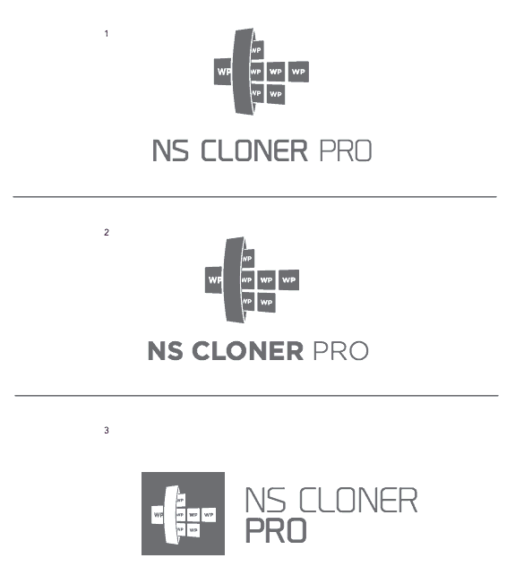
After a few final tweaks, thoughts and discussions of which I will shield you from at this point in the post we all came to an agreement on the font and image layout and essentially the final.

Although the process was just that... a process whenever you land on a final product and brand starting point you always feel a sense of accomplishment. Joe did a great job of listening to all of our ideas, brainstorms, and feedback while still injecting his own creativity and spinoffs into those concepts. We feel that the new brand not only tells the story quickly and effectively but also brings a fresh, modern, and clean approach. We have begun to implement the new brand and you will begin to see it popping up in the various places where it lives. I have coupled it with the old space image for the time being to help maintain something familiarity in the transition although over time I imagine the space theme will disappear completely and we will be in sole reliance on the new brand's clean and crisp look. Have a look at the new banner found on the Wordpress.org plugin page for NS Cloner and hopefully you will see the brand evolve even further over time.

I hope that you enjoyed the journey through the NS Cloner branding process as much as I enjoyed being involved in it. I am always amazed at the effort and challenge that comes with bringing a simple, clean, and effective look to a logo and brand. We hope that this is a great first step in that direction. Let us know what you think in the comments below. Do you like it, love it or hate it?[/vc_column_text][/vc_column][/vc_row]


.png)
.jpeg)


